When you think about the most iconic designs and brands of our time, whether it be the evocative red Ferrari Daytona oozing passion and stimulating excitement, or the striking yellow JCB excavator with its earth-moving prowess; the use of colour has played a significant role in guaranteeing their continued success.

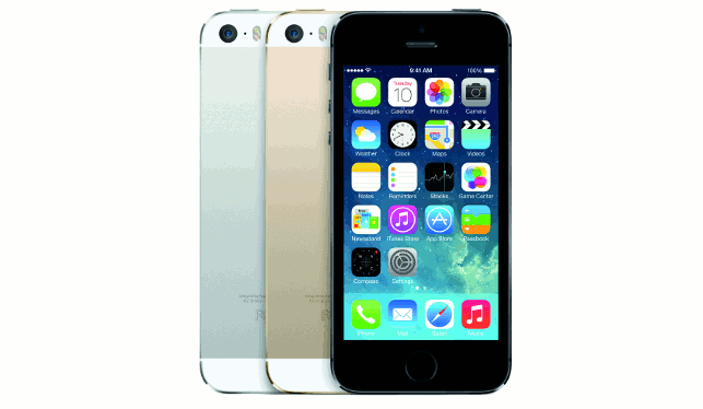
Apple’s choice of colours for its products, such as the iPhone 5s, reflects the brand values of simplicity, cleanliness and modernity
Some may consider colour to be an afterthought, only applied at the end of the design process to add a nice finish to a product. However, colour is a communication method in its own right, with real meaning and emotional depth, evoking strong responses from the viewer. It’s not a static energy and its meaning is constantly shifting from the individual’s point of view.
A common scenario that highlights the importance of colour is clothes shopping. As an individual’s mood from one day to the next differs, colour preference may alter. We’re not always fully aware of these situations occurring as they happen subconsciously.
Red alert
If we single out the colour red and explore its psychological connections, there are many emotions that typically come to mind, from the extremes of love and hate to passion and aggression. It evokes emotions at both ends of the scale, with little in the middle.
Red has also been associated with success and determination, with recent research drawing attention to its effects when used in sports. A study by the Evolutionary Anthropology Research Group at Durham University analysed a range of sporting activities and the colours that teams played in.
They discovered that those who played in red recorded a higher success rate when compared to competitors in other colours.
Does this mean that sporting outfits should be considered further in the future and made the same for both teams of competitors? It certainly raises an interesting point on the power of colour and its impact in relation to competitive situations.
Each colour holds its own personal connection to the human psyche, causing an emotional response when viewed. It is this emotional reaction that holds the key to a product brand, as having the ability to stipulate colour usage creates an opportunity to communicate specific values and meanings to a market audience, giving an impression of what the brand represents.

Yellow is a clear feature throughout the JCB brand
Take the Apple brand as an example, its colour usage across the product range mirrors that of the typical words we may associate with the company. For instance, the familiar tones of white and silver epitomise the values of simplicity, cleanliness and modernity; all of which are close to the heart of the Apple brand.
As a design consultancy, ts design’s interest in colour and its application within product development has emerged over time through engaging with clients looking to add value to the end product without technically compromising the design.
Colour can be a great communicator when used correctly, giving an indication upon interaction, usability, safety, as well as quality and the area of application.
JCB, one of the world’s top three manufacturers of construction equipment provides a good example of colour usage from a functional perspective.
With safety always of paramount importance, colour has been used effectively to strengthen the awareness of others when nearby.
Yellow, a clear feature through the entire JCB brand offers the highest degree of visibility of any colour, attracting the most attention which is a clear advantage to have.
There is also another interesting detail that relates to colour usage, which may not appear as obvious at first.
The features that appear in black include the working parts of the JCB, helping to communicate to the user what features they are responsible for operating. This highlights that its utilisation of colour has no doubt strengthened its ability to relate to the end user.
Colour theory to the test
Colour theory has become fully integrated into ts design’s approach to product development, regularly referring to it at the conceptual and prototyping stages of the design process.
We spend significant time with clients engaging with their product brand to understand what it represents, allowing us to build a character-like narrative of it.
We then allow the product brand to influence our selection of colour by referring to the meanings embedded in colour itself, aligning any similar values to connect the product and brand together. Through following these steps, we are able to explore the potential colour options that could be used with confidence.
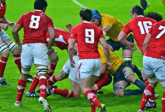
Wales vs Australia, December 2011. Does the colour of a sports kit give a team a competitive advantage
The design team initially incorporates colour within on-screen concept renders, allowing the client to gain a relatively realistic appreciation of how the final product may look, removing the need to primarily invest in prototyping to investigate surface colouring.
Whilst the accuracy of the colour on screen cannot match that of a physical part to reflect upon suitability, it does provide an opportunity to narrow down and select specific colour palettes to move forward with.
Once a direction has been decided upon, we then revisit the chosen palette, referencing Pantone colour charts to identify specific colours for use within prototyping.
Following the colour selection process, we then build it into CAD modelling for prototyping. This offers the best opportunity for clients to see their selected colours in a real life situation whilst still having the ability to make adjustments through the prototyping stage to educate the final product. It is at this stage where a defi nitive colour decision is frequently made.
However, a problem that designers frequently encounter is utilising CAD software on screen for colour selection, knowing that the manufactured product will often differ in colour accuracy. There are some techniques available which help smoothen the transition, one being ray trace rendering.
This allows the designer to create a rendered image that traces the path of light through pixels in an image plane, allowing him/her to simulate the effects of surrounding objects upon the direction of passing light. This technique provides a high level of realism, although it can be a time consuming process as well as computer intensive.
Through operating with commercial realities in mind, we recognised the value in introducing the colour selection process into the existing product development process rather than having to implement new stages.
Ultimately, this saves us critical time and also helps to streamline our services when compared to other alternative methods being adopted.
To contextualise ts design’s approach to colour application, below are two recent projects where colour use was stipulated as an important factor to the end product. Both vary in their nature, but highlight the need for colour to strengthen the appeal in their respective environments and situations of use.
Child’s play
Lovejoy Learning, a start-up company specialising in the field of early learning and child development, contacted the ts design team to help realise a new product opportunity that it had identified.
Through studying childhood behaviour and learning patterns, Lovejoy Learning noticed that young children often struggled to use and accurately manipulate a pair of scissors when cutting.
We provided a new innovative approach towards introducing scissors to children, altering the cutting process by building in features that would promote the development of good cutting skills.
Through limiting the cutting angle of the blades, the scissors offered a more usable cutting solution for young children to develop their dexterity.
It was important to use the product as a physical reflection of the Lovejoy learning brand values, those being responsibility, encouragement and creativity.
The design team followed the process described above to pinpoint colours that embody those ideals, whilst also reflecting on the research already undertaken by the client into children and colour.
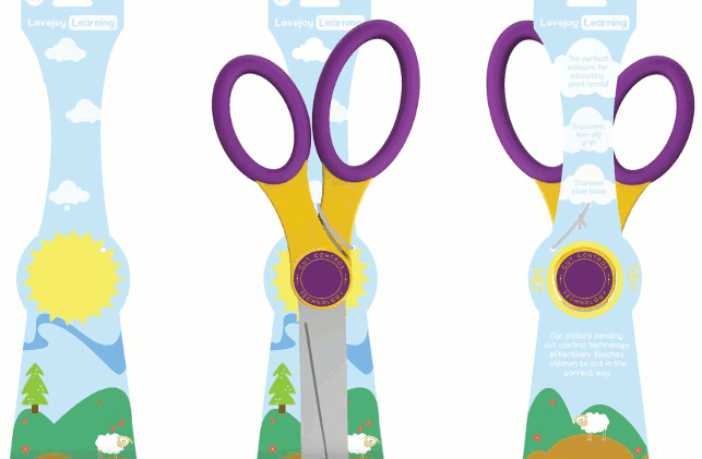
Lovejoy Learning product and packaging design in purple and yellow
The final proposal included deep purple and faded yellow. Purple has a number of visual qualities, most notably the ability to calm and encourage creativity, two values which are close to the Lovejoy brand.
Whereas yellow targets a different set of values, encouraging tactful thinking and interest as well as instilling a sense of optimism and happiness.
Both colours complement each other well through their combined set of values, helping to align the brand to the product. The colours were also fed into the company brand logo which we provided following product development.
Head for colour
Another project that highlighted the need to carefully consider the choice of colour during its development was a new pioneering showerhead developed by Ecocamel.
The company engaged the ts design team to develop, optimise and manufacture a new inlet valve to support the delivery of an air injection technology to reduce water consumption and improve the showering experience.
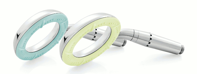
The choice of colours for the Ecocamel Orbit showerheads were torquoise and green
As part of the brief, ts design was also asked to manage the colour selection process for a number of other product development projects the company was undertaking.
The colours chosen for the Ecocamel Orbit shower head product included turquoise and pastel green as both reflect the technical modernity and style conscious values of the brand.
Turquoise is effective in communicating balance and tranquillity, correlating well with the bathroom environment. Likewise pastel green evokes a sense of sustainability and cleanliness, both important values to the Ecocamel brand taking into account the product’s ability to preserve water.
Both examples above illustrate the process that we as a product design consultancy follow to introduce colour within client work, drawing attention to the need for designers to place further emphasis upon its significance as a factor in product development.
As companies continue to appreciate and see value in the power of colour to help attract both investment and build a deeper connection with consumers for their products, we feel there will be a progressive interest in including colour research in the product development process.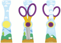
Examining the importance of colour in design & development
Default