
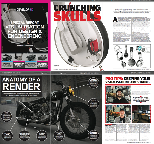
Dave Vogt, manager, advanced concept design, Skullcandy

I keep things fresh by always building my own texture/spec/ bump map assets.
Even if it’s something I can easily pull from online libraries, it keeps my 2D skills sharp, and it allows for easy adjustment and manipulation should you need it down the road.
As far as tips and tricks go… always fillet every edge! No matter how small, rounding every line helps with edge definition and really pops parting lines and material transitions. Especially in those tricky close up detail shots. Fillets!!
Seth Richardson, advanced concept design, Skullcandy:
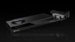
For creating photo-real images you need photo- real assets. Whenever we get samples in, whether it be leather or fabric, I take it straight to our high res scanner and use it as a base image to create a high quality tillable image map at 4k.
Another trick I use to make sure my renders are as realistic as possible is I will photograph the product in a light tent then view from small imperfections to little distortions on painted surfaces. These are all important in a final shot as they add up to creating something that looks realistic.
Never use the same light setup across products, each one is unique and has areas that react to light better (Chrome, for example).
You want to make your images pop and catch the eye. A trick I like to use for this if I am reusing an HDRi asset is to create black strips of geometry to block light, creating the look I want on the reflections.
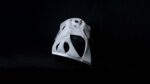
Do your research. What are the physical values of a plastic material, what is its Index of Refraction (IOR), what does its fresnel falloff look like? These need to be recreated faithfully.
The benefit of software today is you only have to do it once. Create the material then save a preset for it that you can simply use later in all your projects. For all my materials I look up every detail. All the way down to each waveform for RGB to ensure I am as accurate as possible. Layering your materials is also a huge part of photorealism.
No material is just simply a colour with a reflection. They are often composed of several layers. Take a brushed steel as an example. The imperfections (brushing) in the metal creates a wide blurry reflection that is often stretched creating an anisotropic effect. Then on top of that exists another layer which gives sharper reflections back, a clear coating.
Lastly, invest in a high quality display. You also need to be sure its colour calibrated. I calibrate monthly in SRGB to ensure that the colours I am viewing are as correct as possible.
This is critical. If your monitor is too dark or too bright you end up adjusting based on what you see which will give you a bad image especially when someone views it on a device that is correctly displaying the render.
DEVELOP3D Visualisation For Design And Engineering Special Guide
Download our free guide to the latest viz software and hardware, plus exclusive pro tips and views on where everything is heading in the future. Not signed up to DEVELOP3D yet? It’s simple and free to do, and you can download our monthly magazine for product designers, engineers, makers and anyone else wanting to join the party – Sign up here.
The experts at Skullcandy’s advanced concept lab share their rendering advice
Default