
Last night we were lucky enough to sneak into Nike’s newest London lair – its Nike+ Innovation spot in the Selfridges department store – where Martin Lotti, Nike global creative director for the Olympics, gave a talk in partnership with Dezeen, about how it had created the 2012 athletes attire.
It is incredible how much changes in the design of Nike’s garments and footwear in the space of four years: the men’s basketball ‘Hyper Elite’ uniform alone is 58 per cent lighter than the one worn in the Beijing Olympics, allowing Nike to incorporate an under-layer of protective body armour to protect the players from swinging elbows and crashes to the court floor.
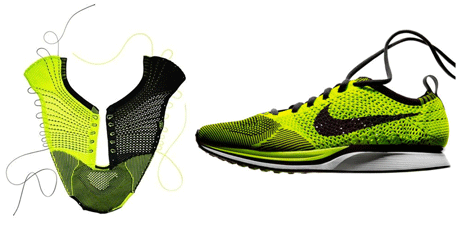
Its entire athletics design mantra seems to revolve around more than simply making things lighter – with four areas key: aerodynamic performance (the golfball dimples in the running suits), sweat management (the ‘swiss cheese’ holes along the jersey’s spine), athlete comfort (Nike’s FlyKnit Racer upper is knitted to be as comfortable as wearing a sock) and sustainable (everything it seems is made from recycled plastic bottles).
Lotti was happy enough to reveal that the R&D department was like a giant playground, and that material science plays a huge part in what developments and styles are viable.
The FlyKnit Racer uppers are today woven like a garment, with strength and support built into the form for each different event (the 200m shoe even differs from the 100m as it has side support built in for running the curve!), but it wouldn’t be too far a step with advances in materials for a 3D printed upper to be created – with all the advances in CFD and strength analysis factored in.
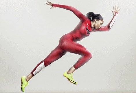
Breaking the design down into components as simple as colouring even has an impact on performance. A runner would have to hit 16mph to benefit from Nike’s Pro TurboSpeed suit, yet the colour-blocking effect, with the fastest moving parts being a contrasting colour gives the athlete and the spectators a real feeling of speed.
“There’s a psychological element to this,” said Lotti. “Now we can’t quantify it – how much faster it is – but they feel faster.”
“When we’re designing this product we’re looking at all elements: delivering upon the needs of the athletes, first and foremost, upon the environment but then even on the viewers looking on TV.”
‘Volt’ is Nike’s hyper-neon yellow colouring for all its track stars’ footwear at the London 2012 Olympics, a colour chosen specifically to contrast from the uniforms being worn by all Nike’s international teams that it supplies, but also the red running track; Nike is now a brand that can now be recognised by the colour of the shoe, even before you can see the swoosh – handy when at a distance, or when seeing the blur of action sprinting towards the finish line.
The question now is how to advance for the next Olympic games in Rio, Brazil? Lotti and his team are already well into planning this, saying this is always the question after every games, but that design and materials always throw up new ideas that make it onto the track, and hopefully the podium.