Having recently rediscovered his love of colour, Al Dean decides it’s about time that the design tools we use every day allowed us to work as accurately with colour and texture as they do with geometry

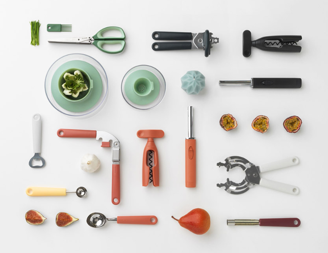
Brabantia’s Tasty+ collection is “a complete new series of high-quality kitchen utensils in soothing colours
It all started, as all good stories do, with an axe. After installing one of those environment damaging wood-burning stoves last winter, I’ve found myself in the market for a new chopper.
By ‘chopper’, I don’t mean a motorcycle of dubious stability, but rather, a tool for chopping up wood. And, as with most men of a certain age, I realised that I already had a half decent one kicking around in the shed.
Fast-forward a weekend and things have got out of hand. Not only has that axe been rehandled and cleaned up, but also the stamped logo has been re-enameled and the handle stained, oiled and, shock horror, painted with a nice flash of bright yellow.
The truth is that while I might have spent the last few years almost entirely dressed in black, I’ve started to find this a little tiresome and begun looking for a little more colour in my life. I’m now finding myself enjoying shades that would have previously sent me scampering for a Sisters of Mercy album and a coffee sans cow juice.
Despite my monochromatic obsession, I’ve always been interested in colour and curious about how colours come to be. There’s also a good deal of interest in how you can represent colour more accurately on a computer monitor and in the design systems we all use.
I’m now finding myself enjoying shades that would have previously sent me scampering for a Sisters of Mercy album and a coffee sans cow juice
While the idea of monitor calibration is finally starting to take root, with many vendors offering built-in solutions, there’s very little support for the output of these systems in our workhorse design systems.
It’s only when you get into the world of design visualisation, with rendering systems, that the idea of being able to accurately tune your digital display to mimic the real world comes into play (ever loaded an ICC profile into KeyShot?)
But why is this? Colour and texture are as important to the look and feel of a product (arguably more so) than its pure geometry. Why is it that we can construct a 100% accurate digital model of the shape of an assembly and simulate its mechanical and thermal behaviour under loading, but representing it accurately, using the correct colour references and textures, requires a third-party application?
And don’t get me started on sound. When the time comes that we can accurately simulate the sound that a car door makes, or that a bin lid makes when that soft close mechanism works just right, I’ll retire and stop moaning.
As a final recommendation, and given that summer holidays are approaching, if you’re as interested in colour and history as I am, then I heartily recommend Victoria Finlay’s Color: A Natural History of the Palette.
Al Dean speculates on how poorly today’s design systems support colour and texture
Default